HaldeBakery
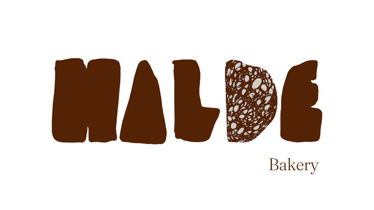
Identity for a Scandinavian artisanal bakery — hand-cut letters, warm bread textures and a slow morning ritual.
Overview
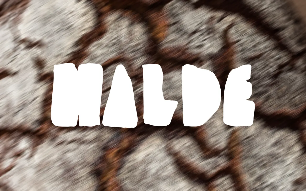
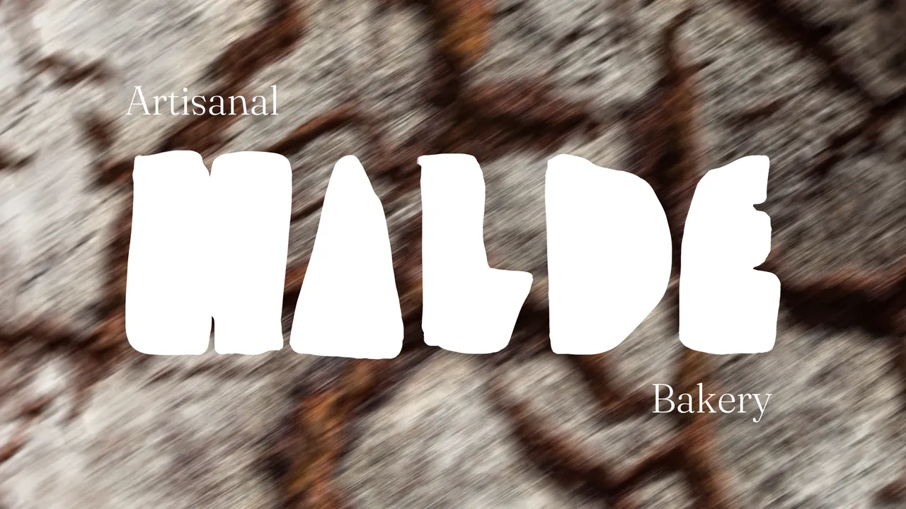
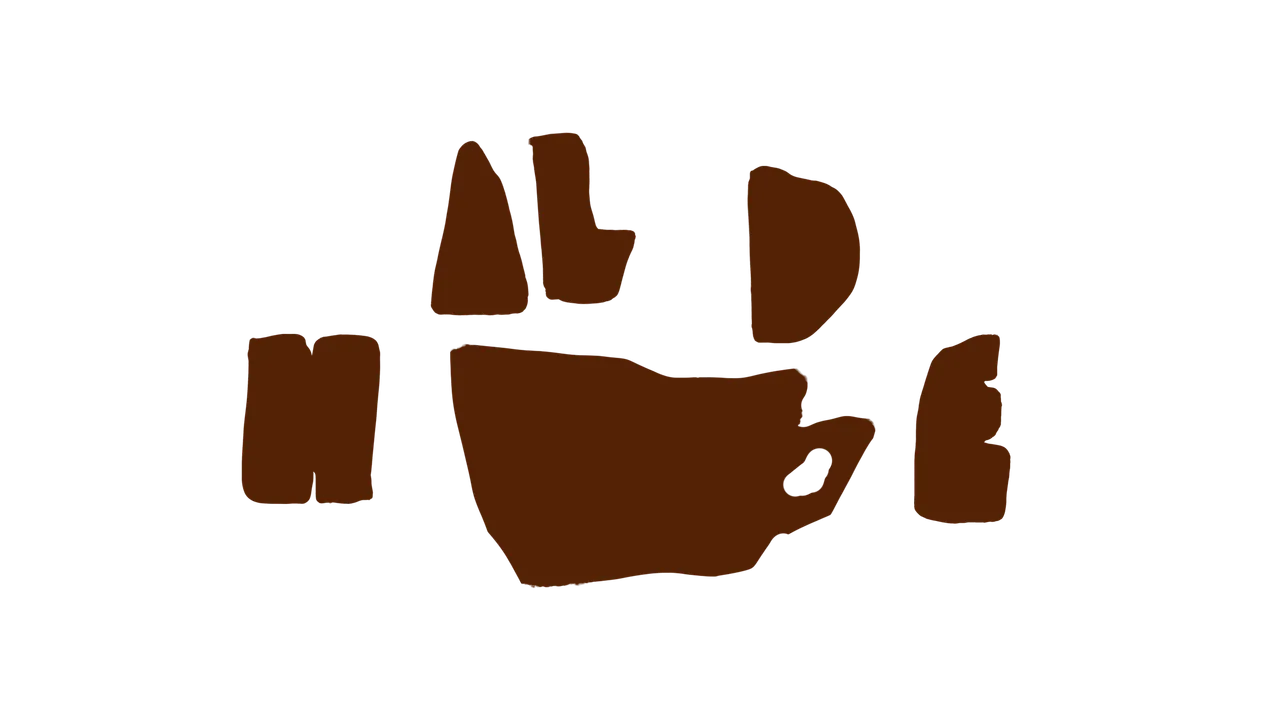
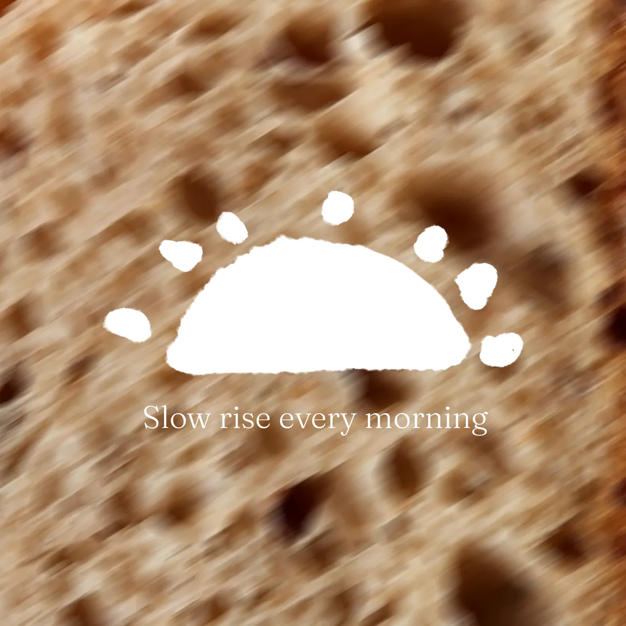
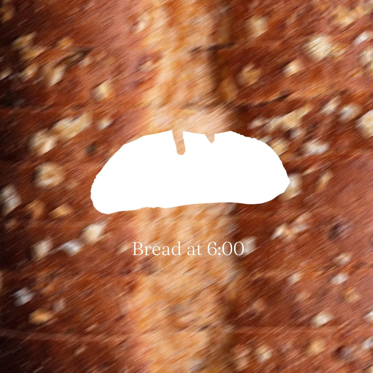
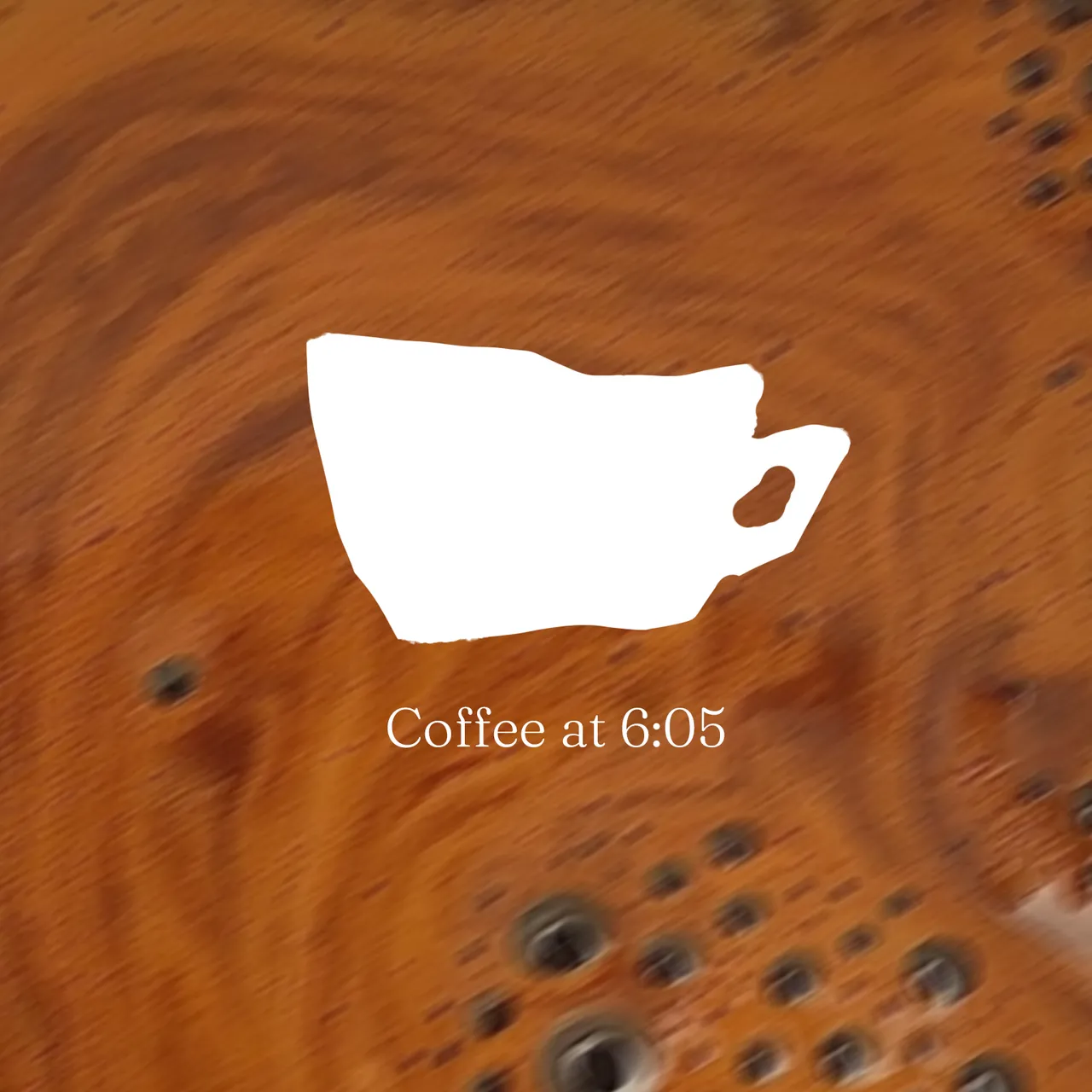
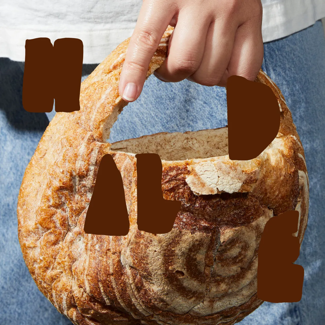
Halde’s identity is cut from what it bakes. Each letter of the wordmark is torn like a piece of bread, the backgrounds are close-ups of crust, crumb and crema, and three hand-cut shapes — a rising sun, a loaf, a cup — mark the morning from the first loaf at 6:00 to the first coffee at 6:05.
- Client
- Halde Bakery (concept)
- Year
- 2026
- Scope
- Identity, Key visuals, Brand applications
- Role
- Brand design / Art direction
- Team
- Karyna Margaryan (solo concept)
Idea
Slow rise every morning
Logo
Palette
Ink#532205RGB 83 34 5
Crust#954628RGB 149 70 40
Crumb#B6AEA5RGB 182 174 165
Milk#FFFFFFRGB 255 255 255
Typography
Fraunces
Aa Bb Cc Dd Ee Ff Gg Hh Ii Jj Kk Ll Mm Nn Oo Pp Qq Rr Ss Tt Uu Vv Ww Xx Yy Zz 0123456789
Bread at 6:00, coffee at 6:05.
Fraunces · Google Fonts
Gallery
01/04
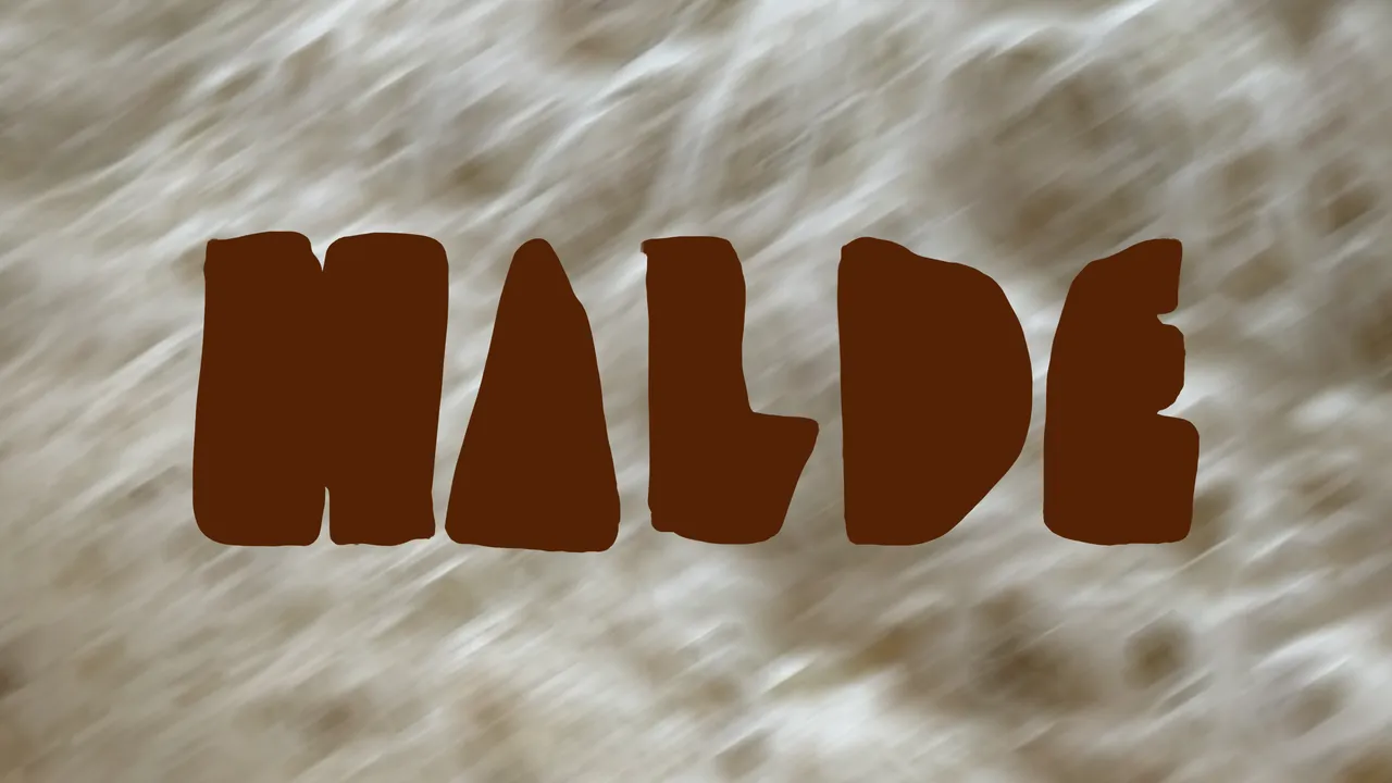
Result
versions of the logo — logomark, wordmark and lockup — built from the same hand-cut letters.